Logo
Here is another version of a Comic Garbage logo. I really like the garbage can so I have been putting it into different scenes to see how it looks. Here is the latest with a metal texture.

blog of Brian & Gregg are Going Places
Hello and welcome to beautiful garbage.
Here is another version of a Comic Garbage logo. I really like the garbage can so I have been putting it into different scenes to see how it looks. Here is the latest with a metal texture.
Posted on 22 November '11 by gregg, under Illustrations. No Comments.
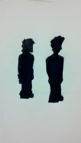
These are the silhouettes of brian and gregg. We want to make them definable by their silhouettes alone. Gregg is on the left – he slouches more, rolls up his sleeves and pants, has a little gut, and his collar is a little more sharp/defined. Brian, on the right, stands up taller, has a smoother/cleaner collar. Gregg is pretty much a straight rectangle while brian is basically two triangles. Â Should one or more of these traits be swapped between brian and gregg? should the traits be more exaggerated?
Posted on 21 July '11 by gregg, under drawings. No Comments.
Copyright 2007 by Your Name.
Design by Igor Penjivrag.
